Base Browsers: IE6.0+, Firefox2.0+, Chrome4.0+, Safari6.0+, Opera15.0+
<expression>:指定媒体查询使用的媒体特性。这类似于CSS属性,如:max-960px。(CSS3)
实例
自适应效果
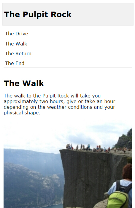
<!DOCTYPE html>
<html>
<head>
<meta name="viewport" content="width=device-width, initial-scale=1.0"/>
<style>
body {
    font-family:"Lucida Sans", Verdana, sans-serif;
}

.main img {
    width:100%;
}

h1{
    font-size:1.625em;
}

h2{
    font-size:1.375em;
}

.header {
    padding:1.0121457489878542510121457489879%;
    background-color:#f1f1f1;
    border:1px solid #e9e9e9;
}

.menuitem {
    margin:4.310344827586206896551724137931%;
    margin-left:0;
    margin-top:0;
    padding:4.310344827586206896551724137931%;
    border-bottom:1px solid #e9e9e9;
    cursor:pointer;
}

.main {
    padding:2.0661157024793388429752066115702%;
}

.right {
    padding:4.310344827586206896551724137931%;
    background-color:#CDF0F6;
}

.footer {
    padding:1.0121457489878542510121457489879%;
    text-align:center;
    background-color:#f1f1f1;
    border:1px solid #e9e9e9;
    font-size:0.625em;
}

.gridcontainer {
    width:100%;
}

.gridwrapper {
    overflow:hidden;
}

.gridbox {
    margin-bottom:2.0242914979757085020242914979757%;
    margin-right: 2.0242914979757085020242914979757%;
    float:left;
}

.gridheader {
    width:100%;
}

.gridmenu {
    width:23.481781376518218623481781376518%;
}

.gridmain {
    width:48.987854251012145748987854251012%;
}

.gridright {
    width:23.481781376518218623481781376518%;
    margin-right:0;
}

.gridfooter {
    width:100%;
    margin-bottom:0;
}

@media only screen and (max- 500px) {
    .gridmenu {
        width:100%;
    }

    .menuitem {
        margin:1.0121457489878542510121457489879%;
        padding:1.0121457489878542510121457489879%;
    }

    .gridmain {
        width:100%;
    }

    .main {
        padding:1.0121457489878542510121457489879%;
    }

    .gridright {
        width:100%;
    }

    .right {
        padding:1.0121457489878542510121457489879%;
    }

    .gridbox {
        margin-right:0;
        float:left;
    }
}

</style>
</head>
<body>
<div class="gridcontainer">
    <div class="gridwrapper">
        <div class="gridbox gridheader">
            <div class="header">
                <h1>The Pulpit Rock</h1>
            </div>
        </div>
        <div class="gridbox gridmenu">
            <div class="menuitem">The Drive</div>
            <div class="menuitem">The Walk</div>
            <div class="menuitem">The Return</div>
            <div class="menuitem">The End</div>
        </div>
        <div class="gridbox gridmain">
            <div class="main">
<h1>The Walk</h1>
<p>The walk to the Pulpit Rock will take you approximately two hours, give or take an hour depending on the weather conditions and your physical shape.</p>
<img src="pulpitrock.jpg" alt="Pulpit rock" width="" height="">

            </div>
        </div>
        <div class="gridbox gridright">
            <div class="right">
<h2>What?</h2>
<p>The Pulpit Rock is a part of a mountain that looks like a pulpit.</p>
<h2>Where?</h2>
<p>The Pulpit Rock is in Norway</p>
<h2>Price?</h2>
<p>The walk is free!</p>
            </div>
        </div>
        <div class="gridbox gridfooter">
            <div class="footer">
<p>This web page is a part of a demonstration of fluid web design made by www.w3schools.com. Resize the browser window to see the content response to the resizing.</p>
            </div>
        </div>
    </div>
</div>
</body>
</html>
正常效果

宽度小于500的效果